Megan Anderson • UX, Branding & Web Design
Megan Anderson • UX, Branding & Web Design

OAKSHOT DISTILLERY
2024
Brand Identity & Visual System
Branding • Packaging • Visual Identity & Messaging
Role: Graphic Designer
OakShot Distillery is a fictional whiskey brand inspired by the Appalachian Mountains, created to appeal to both modern and tradition‑valuing drinkers. The goal was to develop a timeless yet bold visual identity that blends American heritage with contemporary design, while remaining flexible across packaging, signage, and digital applications.
I designed a full brand identity system spanning logo development, packaging, and supporting brand touchpoints. The project earned multiple Student Addy Awards, including Gold, Silver, and Bronze.

The Challenge
Not Just Another Whiskey
OakShot needed a brand that could stand out in a crowded spirits market without feeling gimmicky. The identity had to strike a balance between:
-
Bold and refined
-
Modern and timeless
-
Premium without feeling inaccessible
At the same time, the system needed to be flexible enough to support multiple product lines and future growth.


Ideation
Laying the Groundwork
The ideation phase explored how OakShot Distillery could visually communicate its core values of quality, consistency, and strength. I began by testing a range of logo marks and identity directions, each balancing heritage cues with a clean, modern aesthetic.
Early concepts captured different sides of the brand’s personality, but many leaned too playful or lacked the refinement expected of a premium whiskey distillery. Through iteration and refinement, the identity evolved into a mark that feels confident and enduring, and one that was flexible enough to scale across packaging, signage, and digital applications without losing character.
2024
OAKSHOT DISTILLERY
Brand Identity & Visual System
Branding • Packaging • Visual Identity & Messaging
Role: Graphic Designer
OakShot Distillery is a fictional whiskey brand inspired by the Appalachian Mountains, created to appeal to both modern and tradition‑valuing drinkers. The goal was to develop a timeless yet bold visual identity that blends American heritage with contemporary design, while remaining flexible across packaging, signage, and digital applications.
I designed a full brand identity system spanning logo development, packaging, and supporting brand touchpoints. The project earned multiple Student Addy Awards, including Gold, Silver, and Bronze.


The Identity
Crafted to Last
OakShot Distillery’s identity is built around a commitment to quality, heritage, and restraint. Clean typography, a bold emblem, and a warm, grounded color palette inspired by aged whiskey and oak barrels come together to form a visual system that feels confident, refined, and enduring. Each element was designed to reflect the distillery’s dedication to craftsmanship - not just in the product, but in every touchpoint of the brand.
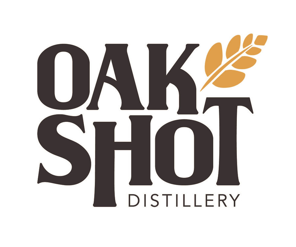
Logo System
The OakShot logo system was built for clarity, strength, and flexibility. The primary mark pairs the Wilson Hawk wordmark with a refined barley emblem, balancing heritage and modern craftsmanship. Simplified icons and alternate logo formats ensure consistency and recognizability across packaging, signage, and digital applications.
Color Palette
Inspired by aged whiskey and oak barrels, OakShot’s color palette uses warm ambers, deep browns, and neutral tones to convey richness and authenticity. Subtle gold accents reinforce the brand’s premium positioning while keeping the system grounded and timeless.
Typography
Typography reinforces OakShot’s bold yet refined character. Wilson Hawk provides a strong, heritage-driven presence, while Avenir offers clean contrast and legibility for supporting content. Together, they create a balanced, modern typographic system that scales across all brand touchpoints.
The Challenge
Not Just Another Whiskey
OakShot needed a brand that could stand out in a crowded spirits market without feeling gimmicky. The identity had to strike a balance between:
-
Bold and refined
-
Modern and timeless
-
Premium without feeling inaccessible
At the same time, the system needed to be flexible enough to support multiple product lines and future growth.


Deliverables
Bringing the Brand to Life
The OakShot Distillery brand was extended into a comprehensive set of applications to test real-world functionality and cohesion.
Packaging & Applications
Deliverables included bottle packaging, event marketing materials, whiskey glasses, banners, and select branded merchandise for customers and employees.

Ideation
Laying the Groundwork
The ideation phase explored how OakShot Distillery could visually communicate its core values of quality, consistency, and strength. I began by testing a range of logo marks and identity directions, each balancing heritage cues with a clean, modern aesthetic.
Early concepts captured different sides of the brand’s personality, but many leaned too playful or lacked the refinement expected of a premium whiskey distillery. Through iteration and refinement, the identity evolved into a mark that feels confident and enduring, and one that was flexible enough to scale across packaging, signage, and digital applications without losing character.


Outcome & Recognition
A Toast to Success
The final brand system positions OakShot Distillery as confident, premium, and intentional - ready to compete on the shelf while remaining flexible for future expansion.
This project reinforced the importance of designing systems, not just visuals. It allowed for exploration of visual language, hierarchy, and consistency - skills that translate directly into real-world branding challenges.
Student Addy Awards:
-
Gold - OakShot Distillery Invitation Card
-
Silver - OakShot Distillery Bottle Label
-
Bronze - OakShot Distillery Billboard Design


The Identity
Crafted to Last
OakShot Distillery’s identity is built around a commitment to quality, heritage, and restraint. Clean typography, a bold emblem, and a warm, grounded color palette inspired by aged whiskey and oak barrels come together to form a visual system that feels confident, refined, and enduring. Each element was designed to reflect the distillery’s dedication to craftsmanship - not just in the product, but in every touchpoint of the brand.
Logo System
The OakShot logo system was built for clarity, strength, and flexibility. The primary mark pairs the Wilson Hawk wordmark with a refined barley emblem, balancing heritage and modern craftsmanship. Simplified icons and alternate logo formats ensure consistency and recognizability across packaging, signage, and digital applications.
Color Palette
Inspired by aged whiskey and oak barrels, OakShot’s color palette uses warm ambers, deep browns, and neutral tones to convey richness and authenticity. Subtle gold accents reinforce the brand’s premium positioning while keeping the system grounded and timeless.
Typography
Typography reinforces OakShot’s bold yet refined character. Wilson Hawk provides a strong, heritage-driven presence, while Avenir offers clean contrast and legibility for supporting content. Together, they create a balanced, modern typographic system that scales across all brand touchpoints.


Deliverables
Bringing the Brand to Life
The OakShot Distillery brand was extended into a comprehensive set of applications to test real-world functionality and cohesion.
Packaging & Applications
Deliverables included bottle packaging, event marketing materials, whiskey glasses, banners, and select branded merchandise for customers and employees.
Outcome & Recognition
A Toast to Success
The final brand system positions OakShot Distillery as confident, premium, and intentional - ready to compete on the shelf while remaining flexible for future expansion.
This project reinforced the importance of designing systems, not just visuals. It allowed for exploration of visual language, hierarchy, and consistency - skills that translate directly into real-world branding challenges.
Student Addy Awards:
-
Gold - OakShot Distillery Invitation Card
-
Silver - OakShot Distillery Bottle Label
-
Bronze - OakShot Distillery Billboard Design